Customizing Your Apporetum Sign-in Page with CSS and Environment Variables
Are you looking to give your Apporetum sign-in page a personalized touch? Look no further! In this guide, we'll walk you through the process of customizing your sign-in page using CSS and environment variables. This powerful combination allows you to tailor the appearance and content of your page without modifying the core application.
Understanding the branding Environment Variables
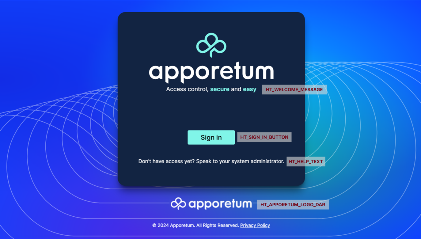
Apporetum provides several environment variables on the SPA app service that you can use to customize various elements of the sign-in page. Here's a breakdown of the available variables:

| Variable Name | Use |
|---|---|
HT_WELCOME_MESSAGE |
|
HT_SIGN_IN_BUTTON |
|
HT_HELP_TEXT |
|
HT_APPORETUM_LOGO_DARK |
|
HT_CLIENT_STYLES |
|
Make sure that you set these environment variables on the SPA app service and not the api app service.
Css File Selectors
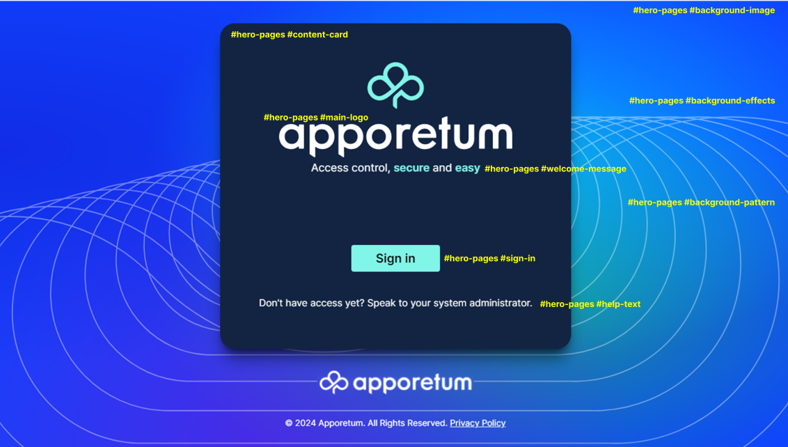
For proper selectivity, all selectors should be preceded by #hero-pages with a space between them.

| Variable Name | Example value |
|---|---|
#background-image | A div for the background image. Use the content: url("full path to image"); declaration to set the image for the background. |
#background-effects | A div used to apply effects on top of the background image, such as blur. |
#background-pattern | A div used to display a pattern on top of the background image and effects. |
#content-card | A div used to contain all the content for the pages. Can be used to set the background and default text colour for all content. |
#main-logo | A div used for the company logo (apporetum by default). Again, set the image using the content: url("full path to image"); declaration |
#welcome-message | Styles the welcome message. |
#sign-in | Styles the sign-in button |
#help-text | Styles the help text |
#back | styles the back button on the Privacy Page |
#privacy | styles the content and text on the Privacy page |
Remember to prefix all selectors with #hero-pages for proper specificity.
Putting It All Together
Now, let's look at how to implement these customisations:
- Set up your environment variables on the SPA app service in the Azure portal. You will find it in the Apporetum resource group.
There will be multiple app services in the resource group. make sure you set the environment variables on the spa app service. When you change the environment variables and save them, the app service will reboot. This will take about a minute to return to service.
| Variable Name | Example value |
|---|---|
HT_WELCOME_MESSAGE | <h2>Welcome to Our Company</h2> |
HT_SIGN_IN_BUTTON | Log In |
HT_HELP_TEXT | <p>Need help? Contact support@ourcompany.com</p> |
HT_APPORETUM_LOGO_DARK | true |
HT_CLIENT_STYLES | https://ourcompany.com/custom-styles.css |
- Create your custom CSS file (custom-styles.css):
The example css code below is the default Apporetum style sheet. You can use it to revert back to the original configuration if needed.
#hero-pages #background-image {
    background-size: cover;
    background-color: #0f43ff;
    background-image: radial-gradient(at 66% 33%,rgba(0,249,255,.55) 0,transparent 50%),radial-gradient(at 0 33%,rgba(21,24,207,.53) 0,transparent 50%),radial-gradient(at 33% 100%,rgba(126,21,207,.53) 0,transparent 50%),radial-gradient(at 66% 66%,rgba(30,221,52,.54) 0,transparent 50%);
    width: 100vw;
    height: 100vh
}

#hero-pages #background-effects {
    position: absolute;
    inset: 0;
    -webkit-backdrop-filter: blur(8px);
    backdrop-filter: blur(8px)
}

#hero-pages #background-pattern {
    position: fixed;
    top: 50%;
    left: 50%;
    min-width: 2000px;
    opacity: .4;
    transform: translate(-50%,-25%);
    content: url(/_next/static/media/p1.3ec810a9.svg)
}

#hero-pages #content-card {
    box-shadow: 0 0 #0000,0 0 #0000,0 20px 25px -5px rgba(0,0,0,.5),0 8px 10px -6px rgba(0,0,0,.5);
    border-radius: 1.5rem;
    background-color: #122442
}

#hero-pages #main-logo {
    width: 24rem;
    content: url(/_next/static/media/logo-aqua-stacked.7b1801ce.svg)
}

#hero-pages #welcome-message {
    color: #fff;
    font-size: 1.125rem;
    line-height: 1.75rem;
    text-align: center
}

#hero-pages #sign-in {
    border-radius: .25rem;
    background-color: #80f5e8;
    padding: .5rem 2.5rem;
    font-size: 1.25rem;
    line-height: 1.75rem;
    font-weight: 700;
    &:hover {
        background-color: #6cdace
    }

    &:active,&[data-loading=true] {
        background-color: #468a82
    }
}

@media (prefers-reduced-motion:no-preference) {
    @keyframes pulse {
        50% {
            opacity: .5
        }
    }

    #hero-pages #sign-in[data-loading=true] {
        animation: pulse 2s cubic-bezier(.4,0,.6,1) infinite
    }
}

#hero-pages #help-text {
    color: #fff;
    text-align: center
}

#hero-pages #back {
    border-radius: .375rem;
    background-color: #0b0fa6;
    padding: .25rem .5rem;
    &:hover {
        background-color: #7bb0f7;
        color: #0e141e
    }
}

#privacy {
    color: #fff;
    padding-bottom: 1.25rem;
    &>h1 {
        margin-top: 1.25rem;
        margin-bottom: 1.25rem;
        font-size: 1.25rem;
        font-weight: 700
    }

    &>h1,&>h2 {
        line-height: 1.75rem
    }

    &>h2 {
        font-weight: 600;
        font-size: 1.125rem;
        margin-top: .5rem;
        margin-bottom: .5rem;
        margin-left: 1.25rem
    }

    &>p,&>ul {
        margin-left: 2.5rem
    }

    &>ul {
        list-style-type: disc;
        margin-bottom: .5rem;
        &>li {
            margin-left: 1.25rem
        }
    }
}
- Upload your CSS file to a publicly accessible URL and set the
HT_CLIENT_STYLESenvironment variable to point to it.
With these changes, your Apporetum sign-in page will now feature:
- A custom welcome message
- Personalized sign-in button text
- Custom help text
- Your company's dark theme logo
- A unique background image
- Styled content card and sign-in button
By combining environment variables and custom CSS, you have the flexibility to create a sign-in experience that aligns perfectly with your brand identity.
Remember to test your changes thoroughly to ensure a smooth user experience across different devices and browsers. Happy customising!

